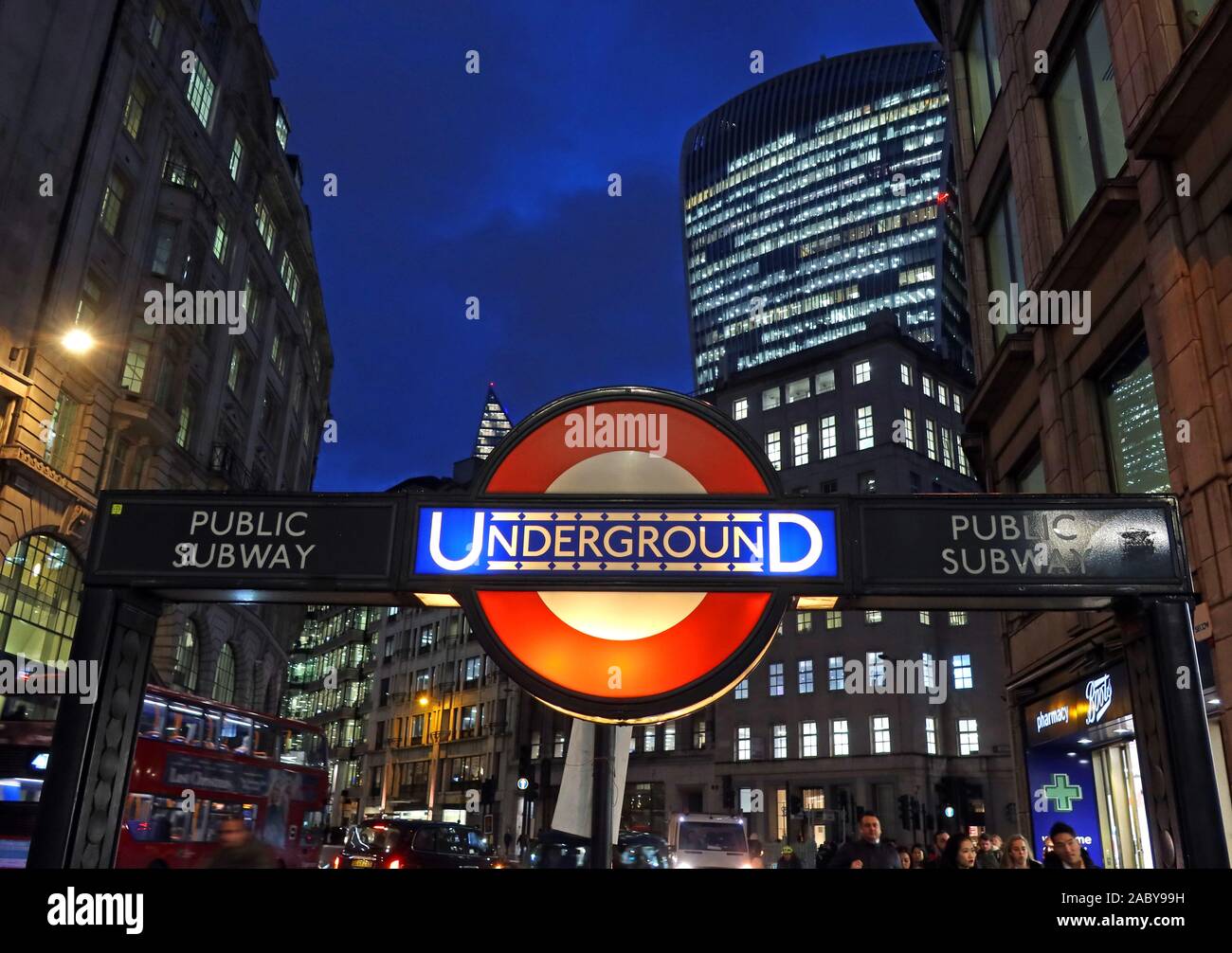
Old style TfL London Underground sign, at dusk in City of London, Bank tube Station, City of London financial district behind, England, UK

Image details
Contributor:
Tony Smith / Alamy Stock PhotoImage ID:
2ABY99HFile size:
50.5 MB (1.6 MB Compressed download)Releases:
Model - no | Property - noDo I need a release?Dimensions:
5004 x 3528 px | 42.4 x 29.9 cm | 16.7 x 11.8 inches | 300dpiDate taken:
26 November 2019Location:
Langbourn, London, England, UK, EC3V 1LTMore information:
One of Britain’s most identifiable symbols is the bar-and-circle Transport for London roundel, which has since its first incarnation in 1908 become not just a globally recognized commercial transport logo but a cultural icon in its own right. Design of the roundel (which until 1972 was referred to as the bull’s-eye) is attributed to no one person and its marriage of abstraction, typography, and form symbolizes nothing in particular. But the crisp, memorable shape that makes it an easy-to-read train station marker has retained its integrity while adapting to changing eras and expanded uses with tweaks to color or typography, all while retaining its power as a symbol, for London’s transit system and the city itself. Dr. David Lawrence, a design historian who teaches at Kingston University, has written a new book on the history of the roundel, A Logo for London The winged wheel designed in 1905 was an early precursor of the now iconic Transport for London bar and circle design. This cap badge issued to bus crews from 1910-14 featured the winged wheel logo of the London General Omnibus Company. One precursor was the London Passenger Transport Board (LPTB) symbol German designer Hans Schleger reimagined Edward Johnston’s bull’s-eye while creating signage. The present red-and-blue color scheme of the Underground roundel at North Greenwich is the most recognized and widely appropriated version of the logo, which has been used as pop cultural shorthand by nightclubs, fashion labels, and the Occupy London movement.